Our rich film heritage wouldn’t be complete without iconic movie posters, and a huge part of it—especially from the ’70s to ’90s—is embedded in the work of Vic Delotavo. Unfortunately, the veteran movie poster designer has passed away last Saturday, May 18. How do we remember him now?
Vic Delotavo first worked in the mid-’70s in the publishing industry of Manila. Back in Iloilo, he was quite a vital element in theater as he designed sets and costumes. Then, fast forward to the ’80s, Delotavo began designing posters for Philippine Cinema. Soon after, this artist became the most prominent designer of film posters including Peque Gallaga’s Oro, Plata, Mata (1982). It was no surprise when Regal, Viva, and Seiko—the past’s big time studios—eventually picked him up to work on paper visuals of more films.
Read more: Nick Deocampo tells us why it’s difficult to preserve Filipino films
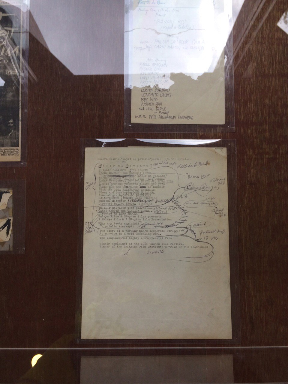
Graphic design in our generation is fueled by easy-to-use softwares that have laid out tools on our screens, like Adobe Photoshop. If ever we need to change a certain shape, color, or font, what we need to do is just click and see the result. As seen in the photo below, our experience today is definitely different from what artists had to do back then. Here, we can see a typewritten list of film credits, with handwritten font faces and sizes. It seemed like graphic designers had to do the layouting and editing in a more literal, careful step-by-step process as compared to now. Clicks still haven’t existed. Today’s backspaces were formerly pen scribbles.
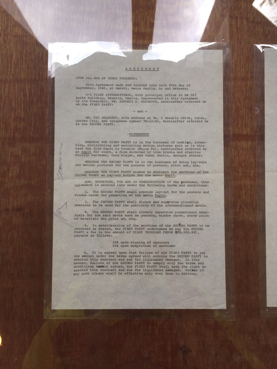
The film poster making process in the ’80s was meticulous and specific, one could not afford making careless mistakes because it took a relatively long time to revise. How does this kind of effort equate monetarily, though? In an 1985 agreement form, it was revealed that a poster, plus window cards and other layouts for promotional print materials for one movie, would cost approximately P8,000.
Read more: You can watch classic Filipino films from your phone right now
The emotionally charged, often playful, and witty creations of Delotavo made tons of Filipino films come to life on print. Here are a couple of posters he made:
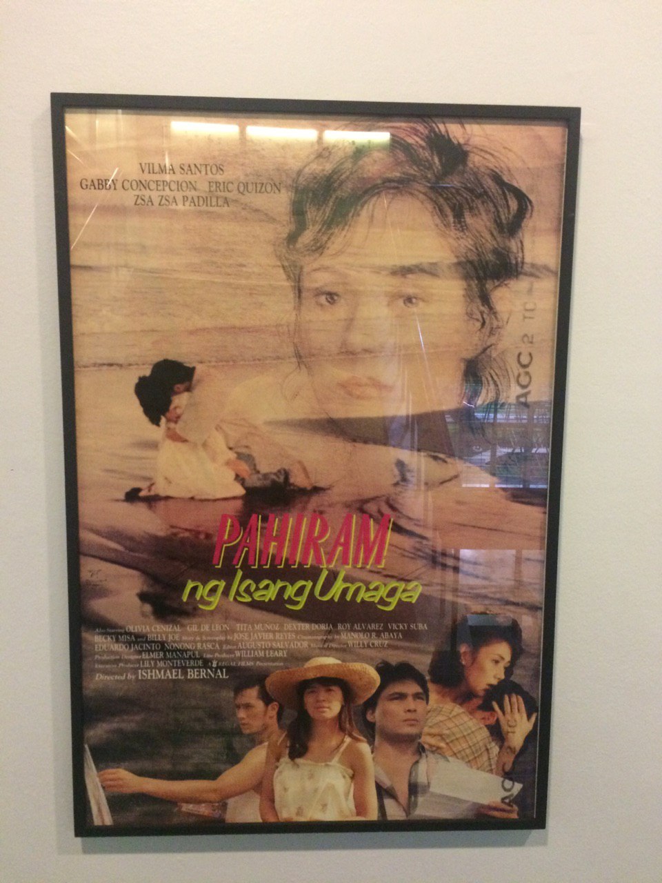
Pahiram ng Isang Umaga (1989) focuses on a single parent named Juliet who struggles to juggle different dilemmas in her life, including raising a child while battling a terminal illness. She then gets pressured to reconsider the effect of going back to past relationships, then eventually finds someone who’s having a mentally difficult time in staying alive.
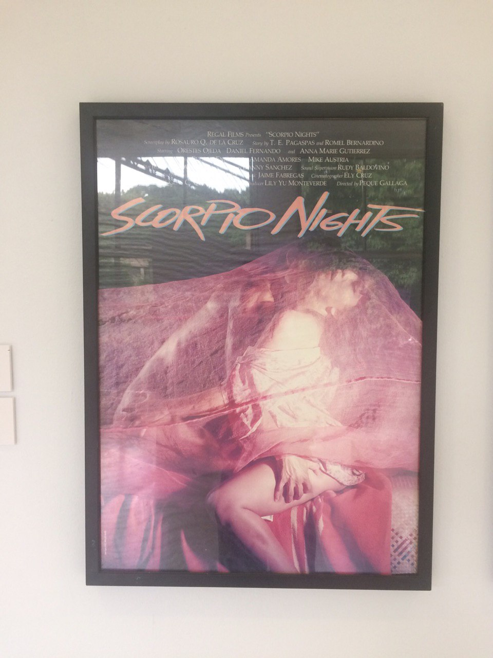
A film class default watch, Scorpio Nights (1985) is often dubbed the most controversial film of the ’80s. The erotic-drama film revolves around three characters in a steaming sexual journey set in a row of apartments.
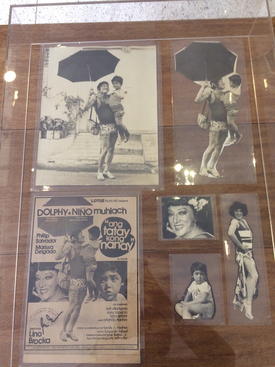
Dolphy plays as gay beautician named Coring in Ang Tatay Kong Nanay (1978). The story follows Coring as he is left with a baby by Dennis, a man he was so in love with. Nonoy, the baby, then grows up thinking that Coring really is his father.
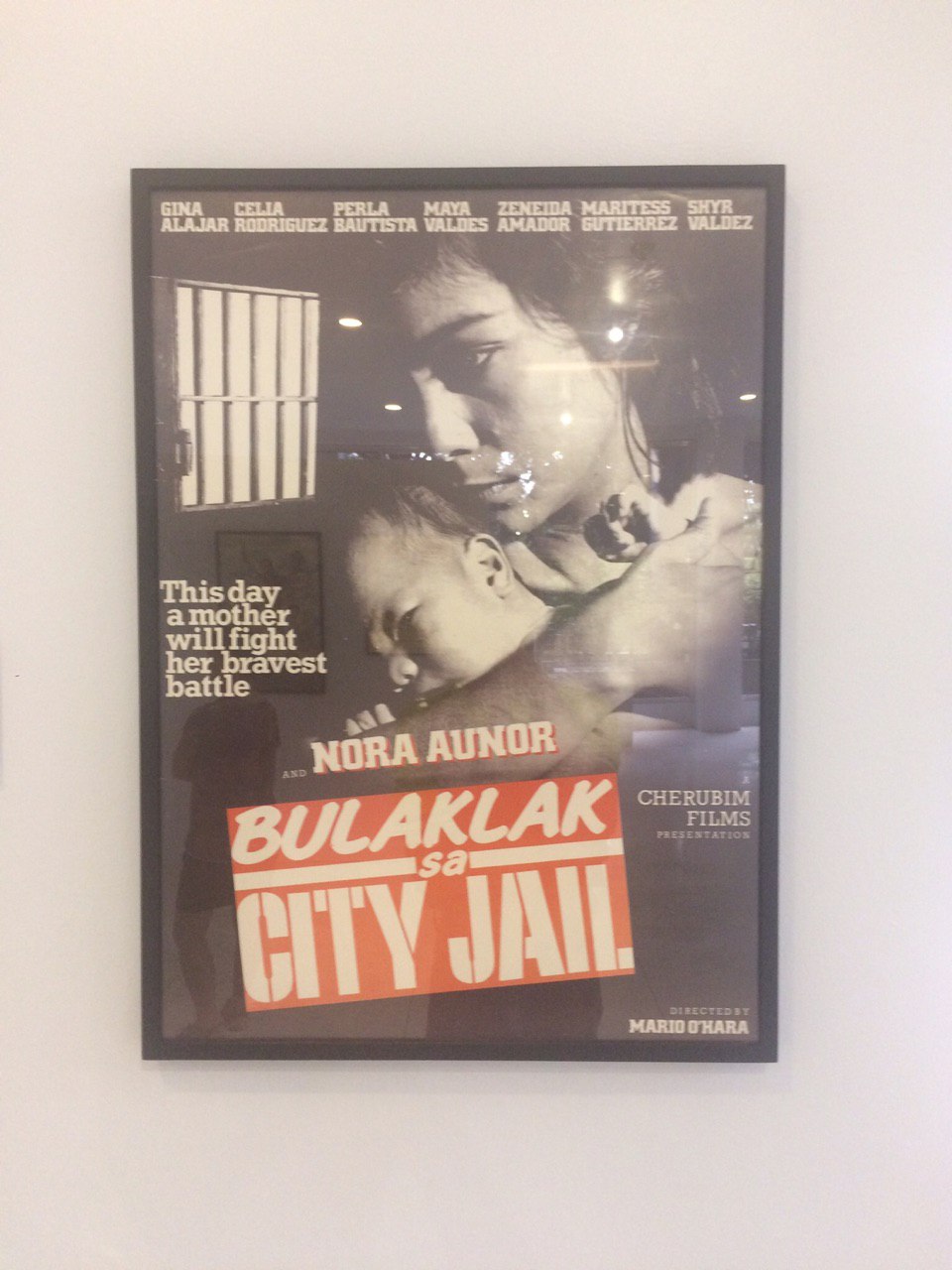
A Nora Aunor classic, Bulaklak sa City Jail (1984) paints the situation of women behind bars.
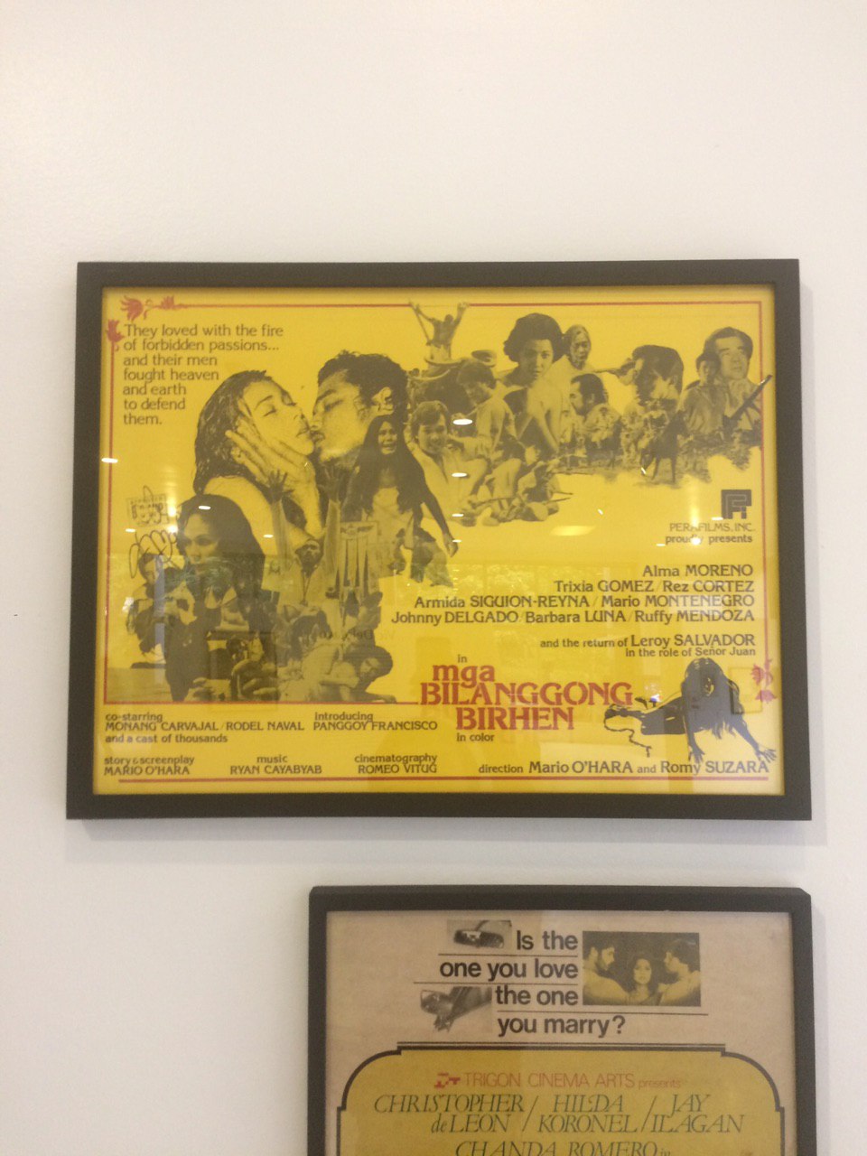
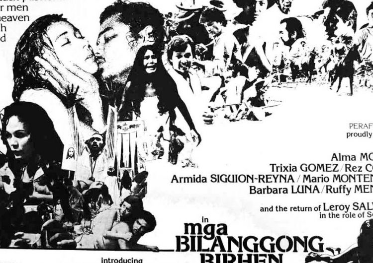
Mga Bilanggong Birhen (1977) is a Mario O’Hara film about a father who wants to hold his daughters captive to prevent them from having relationships with other guys.
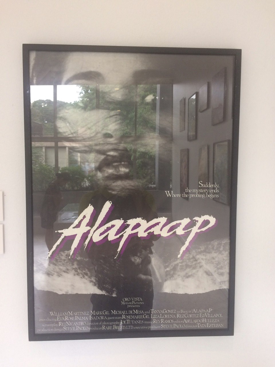
Alapaap (1984) revolves around a group of friends who want to make a film in an isolated place. They eventually find themselves troubled with certain spirits.
Everything we know about graphic design now has stemmed from somewhere deep, and it surely includes Vic Delotavo’s humble practice.
Photo credits to VIC DELOTAVO: Posters for Philippine Cinema exhibit at UP Vargas Museum, April to June 2018









Comments