Signs are everywhere. We see them on the holy painted jeeps, the unresponsive LTRFB numbers on taxis, the random street sign that reads “Bawal umihi dito,” and in your occasional town fiesta’s perya. And yet, we ignore it thanks to normalization. It seems like a forgotten—or perhaps, snubbed—fact that these common signs are by artists and designers.
We accept hand painted signs as part of our culture without question. The “kitschy” signs we see in the palengke, the “ugly” graffiti behind the worn-out seats in public buses, and even the “tacky” tarpaulin greetings from politicians every voting season, are all indicative of how we treat design in our country. Their Filipino-ness is naturally distinguishable, but whether or not we find them aesthetically pleasing is where it gets tricky.

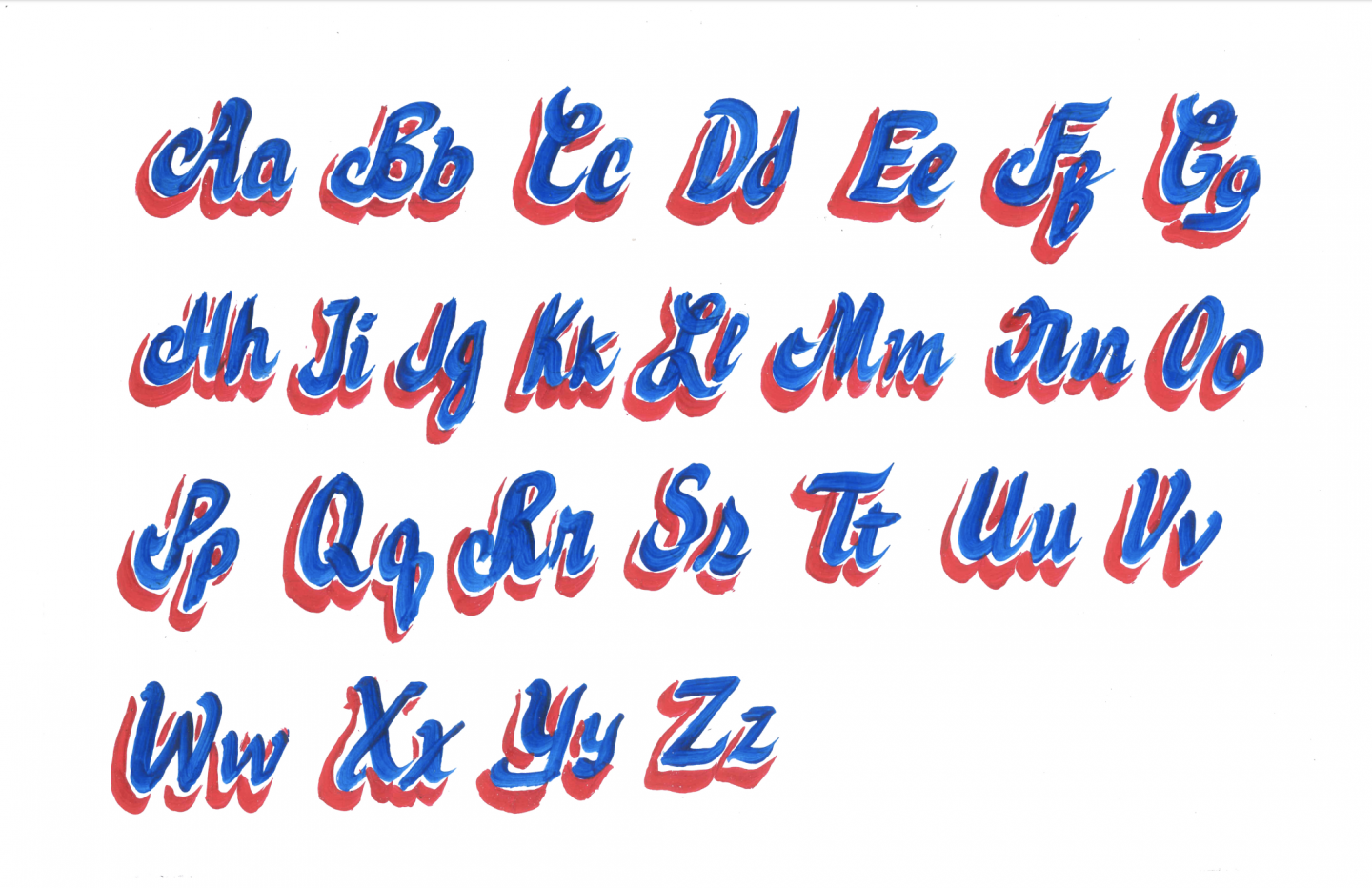
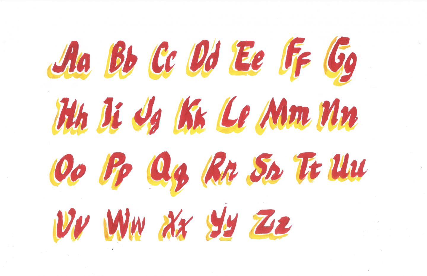
For the majority of us, the “Taxi” style is easily recognizable. Local sign painters call this “sans serif” or “Gothic.” On the same website, this style is described to have letters with pinched corners assumed to be the result of “de-rounding” brush work. The sharp-tipped and single stroke forms that are usually seen on taxis result from finishing a stroke with a brush and a slight flick.
Filipino Folk Foundry (“FFF”), a 310-page book about “vernacular aesthetics” published by the now-defunct artist platform Office of Culture and Design, sang about the dying art of Filipino hand-drawn typography in excruciating length. With barely any academic papers or research written about the subject, the writers meticulously documented hand-drawn signs in the country, interviewing the painters themselves in the process.
In FFF, they used the terms “slow type” or “slow typography.” As opposed to “fast type” or “hyper type,” this kind of typography is handmade, known for carefully measured spaces and beauty in proportion.
Last 2016, the head of the Office of Culture and Design, Clara Balaguer, released a digital project on the history of Filipino graphic design entitled “Tropico Vernacular.” She writes, “Here, minimalism can be understood as a sign of poverty, only surfacing when the designer does not possess enough technical or financial prowess for the addition of borloloy (lavish ornamentation), and fills the gaps with decorations that cost time and signify money.”
Perhaps the Americanization of our culture is what contributes to this generation’s subjectivity in aesthetic. Western elements of design are part of our formal education and in turn, form a hierarchy of what constitutes as “good” and “bad” design. The inclination toward Western standards slowly kills the literally loud expressions of our vernacular and the explosion of colors in both our trash-filled Metro Manila and flowery landscapes in provinces. The minimalist black and white, colors we associate with lament in the Philippines, are taking over.

In Carl David Graham’s enumeration in his website made for his dissertation at DLS-CSB, the title-style “Pancy Letter” was described as the most distinctive style of Filipino sig making. It is done with “either with a single stroke of the brush or made with the former’s style of sharp letter endings. They come in a variety of ‘waviness,’ some being tame and upright and others quite curvaceous.”
***
Mr. Reynaldo Bucal a.k.a. “Steve” comes out of his house and profusely apologizes for the environment: Debris. Grit. Cigarette butts on the concrete floors. There is a hand painted image of the Virgin Mary on the wall, drawn by Steve himself about ten years ago. He’s been painting since high school. He’s now 55.
There’s catharsis of authenticity in the process of hand-lettering as Steve carefully measured the spaces that would go in between. He traced the letters with a pencil while frequently erasing any inaccuracy before applying the paint.
After two hours, he shows us his work, which you see now in these very pages. Art is everywhere but we refuse to clap unless it’s framed and hung on the walls of a prestigious museum. In the modern world where fast living is a cold-blooded thief, humans continue to dig their own graves by letting the purest kinds of creativity die one by one. So, I write.
This story was originally published in our 4th Anniversary issue and has been edited for web. The digital copy of Scout’s 32nd issue is accessible here.


Comments