We shouldn’t have given the new five-Peso coin a pass.
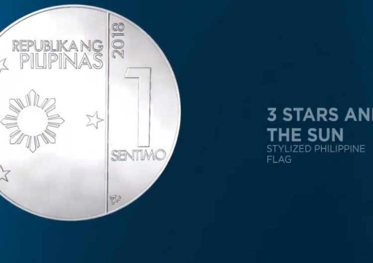
The Bangko Sentral ng Pilipinas (BSP) shared to the public earlier today the designs of the New Generation Currency (NGC) coins, including a video reveal on Facebook:
Aside from the triumvirate of national heroes on the faces of the new coins, there are also some new things to point out. Nolisoli.ph listed down the featured plants in the new designs, which is cool for the BSP to do.
But let’s look at the most obvious thing: they all look alike. From the singular use of non-copper materials to avoid rust to the similar design styles, the Bangko Sentral ng Pilipinas appears to prioritize form over function by removing any distinctions between each individual coin.
The New Generation Currency follows suit from bank notes that were issued last 2010, and the design change of currency is pretty routine every decade or so. But with the latest update, we’re pretty much expecting everyone who handles money in this country (read: basically everyone) to experience confusion, and by extension inconvenience.
The invisible beauty of the previous designs were that we could tell which was which in one glance, whether it’s through color, size, or weight. We appreciate all the security measures taken into consideration with the new set of coins, but let’s be real: it’s going to be hard as shit to tell in one go. We’re wondering: What the thought process was for this? The problem is right there on the face.













Comments